Inspirations, captions, ideas and notes.

Signing up to web services is something that most digital professionals are familiar with, and take for granted. But surprisingly as it sounds, although we know it is important to make the process as simple and painless as possible, what works or not depends largely on your target audience and the problem you are trying to solve.

Examples from existing sites

A couple of months ago, I was researching UI Patterns for registration and sign-ups.  There is no doubt a huge resource of information out there, with some examples that stand out from among the crowd:

  • Facebook
  • Twitter
  • Quora
  • Stackoverflow
  • I’ve collected some screencaps and will share them on flickr soon.

UI Patterns and research on signup design

This is a shortlist of resources I found useful:

Signup 101

There is no end of resources available. In summary, the usual suspects of signup 101 includes the following, but what works or doesn’t work for you will depend on your business, your target audience and ultimately, what it is you are trying to achieve with the signup:

  • Only use signup if there is an obvious benefit (e.g. access to useful/additional content that won’t be otherwise available)
  • The link to the sign-up should be available and obvious – top right-hand corner
  • Lazy signup – Defer signups until totally necessary, if possible
  • Keep the form minimal – Ask for only information that is necessary
  • Only include mandatory fields – if it’s optional, it means we can ask for it later
  • If you must have both optional and mandatory fields, make that difference obvious
  • If the sign-up has to be in steps, or require lots of input, group the details together so they make sense when filling up the form
  • If the sign-up caters to different types of accounts, separate the content of each clearly
  • Don’t rely on hover effects unnecessarily – firstly, they don’t use on touch screen devices, secondly, they can be confusing to the users
  • Provide realtime feedback and contextual error messages – this can be ajax/client-side topped with server-side messages.
  • Don’t display unnecessary details or graphics – they are distractions that distract and confuse

The outcome

  • Our intention was mainly to lock out access by organisations that abuse the site, so introducing the sign-up is something that works well for us; while at the same time, still allow access by individuals that just want to casually browse the content.  The sign-up allows us to identify who is accessing the site and isolate abusers.
  • Although we would have preferred the Lazy signup approach, it works in most situations, but unfortunately not ours because of the underlying objective for introducing the sign-up.
  • To ensure we keep the form minimal, we have segregated the sign-up into 2 types, signup by individuals for personal access of the site; as well as signup by individuals for business access of the site.  This allows us to get more information from businesses and corporations, while ensuring personal access is not hindered. We achieved this we did by keeping the content of each group separate and this is probably something we’ll continue to improve over time.
  • The original design show only mandatory fields.  Although it is not ideal, we have also included a couple of optional fields to address the needs of the business.
  • Realtime feedback is definitely useful, but there is a limit to what we can feedback (e.g. password and re-entered password must match, email format is incorrect); we are finding some users are struggling to type in the correct email address, and this hinders the account activation process.
  • Not displaying unnecessary graphics and texts is definitely key.  Although our original account activation email was very succinct, we felt it lacked friendliness and hence included  what we thought was friendlier copy with additional instructions. Long story short, we have reverted to succinct. Users only want a link to click to activate their account and that’s what the final version provides.

The art?

UI design is an ongoing process, it’s not a one-size fit all science.  On the same note, don’t make the mistake of assuming designing the UI is simple; the upside is, people think it’s simple because we do a good job of making the UI and the process straightforward, the downside is, there is a hell lot of detail that we have to bear in mind whenever planning, designing, developing, testing and launching anything like this.  Don’t assume that it is simple and something that you can put together and launch in a few days. 

I cringe every time I hear ‘free’ and ‘cheap’ whenever people speak about the web. It astounds me how most of us have come to expect everything available online to be free.  The simple truth is, everything comes with a cost. The massive amount of computing power, electricity consumption, time, effort and money that is invested into making the services possible all come with a huge cost. Perhaps they are not direct costs, but the underlying question really is, what is that cost to us?

How we think we benefit

Before we question the cost to us individuals, let’s look at the advantages we are all getting:

  • Twitter allows us to connect with friends and strangers globally. Like-minded individuals share fragments of their lives openly in twitterverse, some more interesting than others; if you’re interested, I had spicy noodles for breakfast because it was a rather cold morning here.
  • Facebook provides us the means of communicating with loved ones and continue to nourish our friendship and family bonds (if you’re using it to connect with family and friends).
  • Linkedin is a professional network which allows colleagues from companies, individuals from various industries to connect at a   slightly more formal level than Twitter and Facebook.
  • Others like youtube, flickr, slideshare, digg, blogs, forums (traditional, or stackoverflow/quora types) are great for sharing content, whether it’s for fun, DIYs, industry knowledge, or professional experiences.
  • Of course, there are the search engines (Google, Bing, Yahoo, etc) which provide us with the means of making some sense of this bottomless pit of knowledge soup, and getting us the pages of information, products and services that we want/need.

And they are all sites we are very familiar with, we use some of them daily. The benefits are immediate in most and the potential is only limited by our imagination. But are we really getting all of this free?

In reality, we do pay

Unfortunately, the answer is no. Because nothing is really free. In return for our ‘free’ use we have, provided them our every keystroke, details of our lives, our very essence of being. Why have just 1 golden goose when you can have a global network of them.

The real questions…

Would you answer truthfully, if a stranger on the street asks, what you have looked up on the internet lately? “It’s non of your business”, you may say in a guarded manner. If a salesperson in a shop asks what your favourite personal products are, would you answer honestly? Or avoid answering in fear of being pushed various other products? And yet, we tell our favourite search engines this everyday.

How much personal information are we ready to share with these ‘Free’ services? In our hunger for knowledge and eagerness to get stuff for free, have we unwittingly become victims of these free services and surrendered ourselves as their commodities, to trade as they see fit? Where do we stand now, now that we’ve become so dependent on these supposed free services, and all that content (search terms, photos, personal details, etc) we’ve provided is already out there? Who has claims to those? Is the provision of the ‘free’ services really sufficient for all that very personal details we are putting out there?

I started typing out my answers to this question “What makes designers frustrated” at the IxDA forum and decided to put my random thoughts here as well.  Many of you will be familiar with the scenarios here.

It’s frustrating if you hear…

  1. “It doesn’t have to look good – that’s not important. Just make it work.” when how it looks will affect site usability.
  2. “The logo needs to be bigger. No, bigger than that. No, bigger.”
  3. “We’re a small company, can you charge us less? Perhaps you’d like your name at the footer for that?” when it’s not really a small company.
  4. “Use your creativity and come up with something” when there’s no brief, no design objective, no direction whatsoever. (This is usually followed by…5, or 6 in this list)
  5. “We like this from version A, this from version B, and that from version C”. Come up with another version which combines them.”
  6. “The background should be like this… and the logo should be here… and the banner should be here… and…”
  7. “No, the ‘sign up’ and ‘buy now’ buttons are too big. They should be smaller than our logo. Nothing should be bigger than the logo on the page.”
  8. “Can we add a scrollbar here, and here, and there.”
  9. “We’re looking for a suitable agency. But first, you’ll have to pitch  for the project with your concepts.” and they are not paying for the concepts.
  10. “Have you finished the design yet?” this morning, when the brief was only yesterday night.

I’m sure you have more to add. We can choose to laugh or cry at these situations, but we should always come out a little wiser and tougher.

Sometimes in our fixation to ensure consistency, we forget that inconsistency can be a good thing.

If we are expecting a different behaviour from the UI, it probably means a different UI needs to be considered. Ok, perhaps not entirely different, but there should be some sort of hint that the UIs behave in different ways in different situation. For instance, buttons for clicking vs buttons as drag and drop elements in the same environment should appear different.

Drawing from our experience with the house we are now renting, where the door knobs took some getting used to – The door knobs are your typical, very simple, classic round door knob, which as you’d expect, open doors. That’s perfectly fine and I don’t have issues with it. The trouble lies in how they work! Yes… that proved to be rather frustrating. See… the same style door knobs were used for all the doors in the house – but some needed turning before you can push the doors open while the rest you just pull and that gets the doors open.

After a while, we figured it out – trust me, our wrists have seen better days – I can see the sense in need for the different operation. Some doors lead to storage areas (these, you just pull) and the others were bedroom and bathroom doors (these you need to turn to open said doors unless you want to hurt your wrists or pull the knobs off!). It took us a while to learn the difference but the point is we shouldn’t have to.

If we are expecting a different operation style, outcome or behaviour, the UI we apply should highlight the difference. Something as simple as different shaped door knob or handles, or perhaps using different colours, would have helped tremendously – and caused far less pain to the users.

So next time you’re working on a project which involves deciding what UI to apply, don’t get too carried away with wanting to be consistent. Consider the operation and outcome; and ask yourself if being consistent would actually cause more pain and confusion.

I’m sure my experience with the door knobs is not unique. Feel free to share your encounters with me as well. It doesn’t have to be technology or web related. 🙂

Are you using Windows XP and having problems with viewing your .asp pages via localhost?  If you’re having trouble viewing your ASP.NET / .ASP pages, and can swear that IIS has been installed successfully like I did (hah), perhaps these steps will help you, like they helped me.

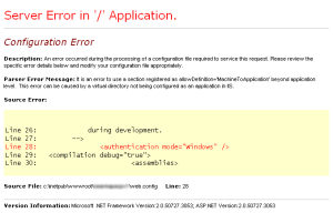
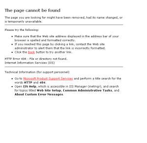
I was able to view the .asp site while the debugger in Visual Web Developer 2008 was on and the project was open.  Once the project was closed, or if I was not in Visual Web Developer, I get this error message when trying to view the same site through “http://localhost/sitename/about.aspx”

The page cannot be found…

Page Cannot Be Found

Page Cannot Be Found

It’s possible serving of ASP and ASP.NET pages have been prohibited.  To resolve this,

  1. Click on [Start], select “Run” and you’ll see the Run dialog box open.
  2. Type “inetmgr” and click [OK] to open your Internet Information Services (IIS) Manager.
  3. In the left panel of the IIS Manager, click on [+] next to your computer name, to expand the menu tree.
  4. Click on “Web Service Extensions” to display the list of web service extensions in the right panel.
  5. You will see “Active Server Pages” and “ASP.NET v2.0…” listed in the right panel along with their current status.  Mine were “Prohibited” on both counts.
  6. If the status is “Prohibited”, click on the service you wish to allow, e.g. “Active Server Pages”, and click on the [Allow] button.  This changes the status to “Allowed”.  I selected “allowed” for “ASP.NET v2.0…” as that is what I need.
  7. You should be able to view your .ASP site via “http://localhost/sitename/” by now.

These were the steps I used, and they worked for me.  I hope you’ll find them helpful.  Good luck! 🙂

Addon – 28 May 2009 11:55am

Just to add, if you have completed the steps above and have made some progress but encounter this error:

“Server Error in ‘/’ Application”

Server Error In '/' Application

Server Error In '/' Application

It is possible the site has not been setup properly still. At the IIS manager (see earlier steps for opening the IIS manager and expanding the menu tree), click on [+] for “Application Pools”, and then for “DefaultAppPool”.  If you only see “Default Application” and no other application names that resembles your site name, follow these steps as well:

  1. In the extended menu tree of the IIS Manager, click on [+] “Web Sites” and then [+] “Default Web Site” to reveal the list of sites currently in your wwwroot folder.
  2. Right-click on the site you wish to setup to be viewed in using IIS via “localhost”, e.g. [+] Testsite1, and select “Properties” to open the properties window for your site.
  3. The Properties window has several tabs, namely, Directory, Documents, etc.  Make sure the “Directory” tab is selected.  If the Application name label and text field is greyed out, click on [Create] next to it.  The label and text field is no longer grayed out and your sitename (e.g. Testsite1) appears in the text field.
  4. Click on [OK] to confirm and close the site properties window.
  5. Now, you should be able to view your site using the “localhost” url through your internt browser. E.g. http://localhost/Testsite1/Default.aspx

Once again, these steps worked for me, I hope they work for you too.  Feel free to drop me a note if you wish to add or suggest anything.

Getting error messages while installing Skype on Vista? A quick search on google shows there are many challenges to installing Skype on a Vista machine.

I tried installing Skype sometime ago on my 64-bit Vista OS machine, and it refused to install properly.  I since learnt that Skype works only with 32-bit Vista OS machines, and thus was able to install it on my 32-bit system without any problem.  This was in November 2008.  It was rather frustrating for me, as the download page promised that the installation would work for 64-bit Vista, but it didn’t.

Recently, a tweep was having trouble installing Skype on Vista. The error message encountered was “can’t create installation file…” I immediately responded thinking it was the 64-bit os problem again, and this time I was wrong.  It turns out Skype has released several new versions since last November, 5 to be exact.  The latest version at this time being 4.0.0.244.

As he had tried downloading and installing the latest version of Skype onto 2 vista machines to no avail, I suggested that he tried installing an older version instead.  I suspect  that Skype’s updates may have broken something which has somehow rendered the later version uninstallable on Vista.  I’m using 3.8.0.188 (released in Nov 2008) and it works fine for me.

He tried my suggestion, downloaded and installed the older version successfully.  So the Skype+Vista combi works for him now. 🙂  I’m very pleased  for him, and thought I’d put this note down as a reference for anyone else out there who may be experiencing the same challenge.

If you have a similar problem, have tried other solutions in vain and would like to try installing an older version, you can download them at this oldapps.com.  This web site has old versions of applications which can come in handy sometimes. Yup, newer is not always better.

I’ve notified Skype of this issue, so this will hopefully be an interim solution for those of you having this problem.

Having searched in vain for this information since last year, I’ve decided to migrate to gmail. The frustration I faced was mainly with the fact that I can retrieve my emails from gmail using Windows mail and outlook, but I couldn’t do the same with hotmail. In December, I finally got an iPhone, and faced the same issues with access once again, with hotmail.

It seems this information is rather hard to find, and brings to mind Microsoft’s lack of attention towards usability. The help facility in hotmail is tucked away in a far corner (a tiny, round, blue icon; under the “sign out” link, next to the “Options” link). I thought it was the help facility for Settings! Silly me… and yes, I digress.

Setting up your email client

If you are looking for instructions to setting up your mail client to retrieve emails from your hotmail account, these listed in the hotmail help are for Outlook Express:

  1. In Outlook Express, click the Tools menu, and then click Accounts.
  2. Click Add, and then click Mail.
  3. Type your name, and then click Next.
  4. Type your full Windows Live Hotmail e-mail address, and then click Next.
  5. Enter the following information, and then click Next:
    • In the My incoming mail server is a box, click POP3.
    • In the Incoming mail (POP3, IMAP, or HTTP) server box, type pop3.live.com.
    • In the Outgoing mail (SMTP) server box, type smtp.live.com
  6. Type the account name and the password for your Windows Live Hotmail account. Clear the Remember password check box unless you’re the only person with access to the computer. Make sure that the Log on using Secure Password Authentication (SPA) check box isn’t selected.
  7. Click Next, and then click Finish.
  8. In the Internet Accounts window, click the Mail tab, click the Windows Live Hotmail account that you added, and then click Properties.
  9. Click the Advanced tab, and under Server Port Numbers, enter the following information, and then click OK:
    • In the Incoming mail (POP3) box, type 995.
    • In the Outgoing mail (SMTP) box, type 25.
    • Under both Outgoing mail (SMTP) and Incoming mail (POP3), select the This server requires a secure connection (SSL) check box.
    • Click Close.

The above instructions will vary slightly if you are using another email client, but most of the parameters you need are there, so you should be able to get your hotmail emails in no time.

Finding the above instructions via hotmail

If for some reason the above doesn’t work, perhaps the other help information listed in hotmail can help you.  Here are the steps to finding the instructions you need:

  1. Look for a small blue round icon with “?” symbol. You will find it on the top right hand corner of the hotmail post-login screen, under the “sign out” link, next to the “Options” link.  Click on that icon and a popup window will appear.
  2. Select “Table of contents” in the left panel.
  3. Click on “Setup a Windows Live Hotmail Account”.
  4. If you are setting up for outlook express, follow the instructions by selecting “Add your e-mail account to Microsoft Outlook Express”
  5. If you need the pop3 and smtp settings for any other email client, select “POP3 settings”

Setup for iPhone users

The setup for iphone is very straightforward, and we wouldn’t expect anything less, would we? 😉

  1. Select Settings
  2. Choose Mail, Contacts, Calendar
  3. Under Accounts, choose “Add Account”
  4. Select “Other”
  5. Provide your name, email address and password; select “Save” when done.
  6. Your iPhone will verify the account information and once that is done, you can start retrieving your hotmail emails via your iPhone.

I had given up the notion of getting my hotmails on my iPhone and using an email client instead of using the browser, but thanks to my twitter friend @echo6ix who shared this information with me, there is still hope for hotmail in my books.

I hope you find this helpful.  Good luck and let me know how you get on. 🙂

It’s been a while since I last blogged (almost a year, I think) as I trackback and try to find a new way forward.  I have to thank @goatlady for giving me that extra push and a great excuse to get the ball rolling with her Ada Lovelace Post. 🙂  For those of you wondering what the fuss is all about, you can have a look at the AdaLovelaceDay Pledge.

Over the past few months, I have been blessed with many new friends, most of whom I have met via Twitter.  While I familiarise myself with this new yet not so new environment called Perth, the encouragements and suggestions from these tweeps have given me strength and hope. It is not easy to start anew in a place with zero friends.  Thus, I feel these women deserve a mention in my Ada Lovelace Day tribute: @goatlady, @developit and @cindyleigh.  Two other women that have influenced me were a couple of ladies I had the honour of working with while at Aviva Asia: Joanna Leong and Amy Hoe.   These women are not just going with the flow like most people are; they have taken the reigns of leadership roles, each in their own way, while balancing a full life of being wife, mother, entrepreuner, friend and every other role they play.

@goatlady (Kay Smoljak) – What intrigued me about Kay was her colourful percussionist past life.  Kay currently runs Clever Starfish and wants to make the web a better place for everyone.  What makes her different is she’s not just saying it, but she is actively doing something about it – being in the Port80 committee, the Australian Web Industry Association, and also the sub-committee of the WA Web Awards. She’s one of the organisers of the Perth Web Standards Group, and a co-founder of Web Women, a local networking group for women in the industry. Yes, talk is cheap. Kay is a great example of “don’t tell me what you can do, just do it…”.

@developit (Frances McLean) – is a freelance software developer and consultant, who is also a part-time Information Technology lecturer at TAFE in Western Australia. She delivers PD (Professional Development) for staff members and is involved in developing Assessment tools for staff to use on PDA’s (Portable Digital Assistants).  She has taken her love for technology, developed it into feasible solution and shared it with those around her to make their lives easier via mobile devices.  The amount of focus and discipline needed to achieve that is tremendous and I am excited to see what she has in her sleeves for the next reveal.

@cindyleigh (Cindy Prosser) – is a proprietor and head designer of Attitude e-media.  Cindy has been floating in the digital web space since 1995 and it is her passion for CSS Design & Green IT that inspires me.  She believes that the IT industy has the capacity of reducing greenhouse gas emissions enormously. And her company invested in running their infrastructure on Natural Power, which is an energy that is generated from renewable sources with minimal impact on the environment. Once again, a great example of putting passion into action.

These last 2 names are by no means the least important to me. In fact, they have been my key inspiration for the last 4 years. It is unfortunate for me that we have now gone seperate ways, but I do look forward to the day when our paths cross again.

Joanna Leong – is currently a Senior Manager of the Business Systems team in Aviva’s Asia Pacific I.T. Department based in Singapore.  I had the honour of working closely with her in several key projects, and her grace and strength still inspires me today.  Joanna’s no-nonsense down-to-earth management style makes it possible for each of us to bring our strengths and knowledge to the table.  She is a proactive manager and always has the welfare of her team at heart.  She taught me that one does not need know-it-all to be a good leader. One can be successful and build a strong team which everyone is envious of, if one can tap on the strengths of the individuals within the team and unite them.  She is a true leader and I see a lot of her in my leadership style. But I still have a lot to learn.

Amy Hoe – is currently the IT and Operations Director at Aviva Asia (based in Singapore).  Amy is a charismatic leader and in my opinion, she is better at this role than many of her male counterparts.  It is almost impossible to find a leader at her level that still takes pride in getting to know all the staff that contributes to the teams that she manages.  Her ability to balance micro- and macro- management leaves me in awe and her track record is proof that her formula works.  Her achievements include setting up a regional IT shared services; championing customer strategies; supporting large scale direct marketing call centres across Asia; and rolling out SOX compliance projects for CIGNA.

I am very honoured to be able to name these leaders as my friends. And am truely blessed to have such inspiration that I can learn from.

With the hassle of web maintenance, companies are finding it a challenge to keep their web sites up-to-date after the initial launch. Getting it designed and published for the first time is great! The site looks new and fresh. But after weeks… months… years… without proper maintenance, the web site can become a stale and uninviting, which does not reflect well on the site owners.

Most smaller firms are not keen to hire a web master full-time, and some larger ones have an entire team looking after their web assets. But even with a large team, it is sometimes still cumbersome to update the site content with fresh releases, as these often come from the brand/communication channel, whereas the web team tends to be based as part of the I.T. department; and hence the update gap – where press releases sometimes do not get posted on the corporate web site a week after they appear in news sites or papers.

Some organisations have chosen to use content management tools to help them close this gap. However, content management tools range from the freeware that cost nothing (e.g. OpenCMS) to those that require a hefty investment (e.g. Interwoven). So, how do we know what is suitable? It’s anybody’s guess. I’ve been doing some research on this lately, and my friend Google has turned up quite a few articles on various web content management tools. Not all of them are very meaningful and some require payment before you can read anything. But I have found several useful writeups here and there, and will list them here so it is all ‘under one roof’ for if anyone else needs the reference… and I’ll update it as I go along.

5 reasons why Drupal is not Enterprise ready

Many Open Source content management systems written in PHP want to be recognized by the business industry as being “enterprise” ready. This is not only a mark of prestige and status but places them in a position where large companies are ready to invest in the software as a platform for their projects. Drupal is now trying making its move to be enterprise ready but has a long way to go.

I keep coming across interesting development, coding or javascript sites but have not jotted them down… only to have trouble finding them again when I need them later. Sigh… yup, so here is a list, in no particular order. I’ll update this post as I go along…

Web Development

Javascript